28 October 2026
Wearing colour intentionally: what your jewellery palette says about you
The colour we wear is never random. In jewellery — objects chosen with more intention than everyday clothing — colour psychology amplifies. Discover what your palette communicates and how to choose the right colour for your next piece.
When we enter a jewellery shop — or open our drawer in the morning — the choice of colour seems automatic. We take what feels right in that moment. But if we pause to observe this gesture with a little more attention, something interesting emerges: the colours we choose to wear are never truly random.
Colour is one of the most immediate and powerful non-verbal signals that exists. It precedes words, precedes form, precedes almost every other piece of information we transmit to others. And when it comes to jewellery — objects chosen with a higher degree of intentionality than everyday clothing — this power amplifies.
Colour psychology: not superstition
Colour psychology is a well-established field of study, with decades of research behind it. It is not about mystical interpretations or fixed universal meanings — red does not mean the same thing in all cultures, and white can symbolise mourning in some and purity in others. It concerns instead the emotional associations that colours evoke in specific contexts, and the way these associations influence both whoever wears them and whoever observes them.
In the West, certain associations are fairly stable: blue is associated with calm, trust, depth; green with balance and growth; red with energy, passion, vitality; black with elegance, authority, protection. But beyond these general associations — which anyone can find in any visual communication textbook — there is a subtler and more interesting level: the personal relationship with colour.
Each of us has a history with colours. Colours we associate with happy or painful moments in our lives. Colours that feel innately part of our identity. Colours that feel distant, that we avoid without quite knowing why. This personal dimension of colour is often more relevant than any general interpretation.
Colour in jewellery: a different choice from clothing
Choosing the colour of a jewel is a different operation from choosing the colour of a garment. Clothing covers, envelops, dominates visually. Jewellery is precise: a point of colour on a wrist, a flash of light at the throat, a detail at the ear. This precision makes it, paradoxically, more eloquent.
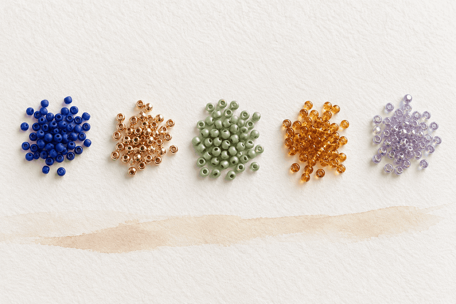
A single iridescent crystal catching light on the wrist says something far more directly than an entire jacket of the same colour. Because it is a precise, isolated choice, undiluted by practical necessity. Whoever wears a bracelet in mauve-toned beads has made a choice that has nothing to do with function: it is pure expression.
In BBLux's work, the choice of colour is one of the most delicate steps in the creative process. Not only because it determines the aesthetics of the piece, but because — especially in bespoke pieces — it is often the step at which something authentic about the person who will wear it emerges.
How colour changes with light: the particularity of beads
There is an aspect of colour psychology that becomes particularly relevant when talking about beaded jewellery: colour is not fixed. Miyuki beads, depending on their finish — matte, glossy, metallic, iridescent, AB — respond to light in completely different ways. A metallic gold bead under direct sunlight and under soft artificial light look almost like two different objects.
This means that a beaded jewel does not have a colour, but a chromatic behaviour. It responds to its environment. It changes throughout the day. And this change is not a flaw to be avoided: it is one of the most compelling qualities of the medium.
Whoever chooses a BBLux jewel with an iridescent finish is choosing something that never fully settles — that carries a luminous variability that mirrors the variability of life itself. Whoever chooses a matte, uniform finish is choosing something more still, more definitive, more contemplative.
Colours that heal, colours that protect
In esoteric tradition and chromotherapy — disciplines that Lucia Battiloro knows through her years of NLP and coaching study — colours are associated with specific energetic properties. Not in a literal-causal sense (a colour does not cure a disease), but in a symbolic-intentional one: choosing to wear a certain colour can become an act of affirmation, a daily reminder of something one wishes to cultivate.
Aqua and turquoise are traditionally associated with communication and expressive clarity. Purple and lilac with spirituality and intuition. Pink and peach with emotional openness and self-care. Gold and golden yellow with confidence and solar energy. None of these associations is binding — but all can become tools for a more conscious choice.
Finding the right colour for you
There is no infallible method for choosing the right colour in a jewel. But there are some useful questions: What colour makes you feel most yourself when you wear it? Is there a colour you have always avoided that might be worth exploring? What do you want this jewel to do for you, emotionally?
In our configurator, the choice of colour is guided — not imposed. We show you the possible combinations, the available finishes, the luminous effects each choice produces. The rest is yours.
Because the right colour is not the most beautiful one in absolute terms. It is the one that resonates with where you are now, with who you want to be, with what you want to carry with you every day.